by Al Belote | Jun 26, 2009 | design
I made this when I was about five years old. I think it was a school project for mother’s day. I was visiting my mom a few months ago and ran across it. I guess it was a paper weight. I like the color and pattern choices I made. I would like to say I remember...
by Al Belote | Jun 13, 2009 | Uncategorized
One of my favorite places for breakfast is the City Room in Nashua, NH. And I can prove it. Pictured above are just a few of the many receipt tabs that I save every time I go there. It’s a place that still has actual written-out dining checks, so I always grab...
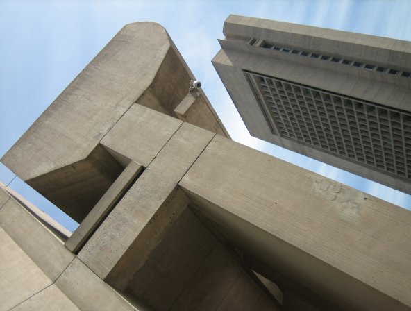
by Al Belote | Jun 11, 2009 | architecture, Uncategorized
While I’m giving accolades to the Admin building, here’s another view, framed by its neighbor across the Plaza, the Colonnade building. On a cold gray winter day the Colonnade looks like part of a battle-damaged science fiction movie spaceport....
by Al Belote | Jun 10, 2009 | architecture, Uncategorized
Few people I have talked to in passing love it. Most would say it is stark or brutal (true to the style) or comment on the “unsightly” weathering of the concrete. But I happen to love it, in spite of those qualities. Perhaps, in part, because of those...
by Al Belote | Jun 5, 2009 | photography
I upload my digital photos to iPhoto. I get film processed and burned to cd (no prints). Then I upload whatever is worthy, and then some, to flickr. It’s great. Except for one thing. The proof sheet (and I mean the 8×10 kind on real photo paper) is not part...